
Hopper App
The best way to book online travel.

How it STarted
Hopper's aim is to be the world's best and most fun place to book travel. As North America's most downloaded app, they have set their sights on the global market.
From day one, Hopper has used their ability to make the most accurate price predictions from their algorithms & trillions of data points. This fully remote company looks to take on companies like Booking.com and Expedia.
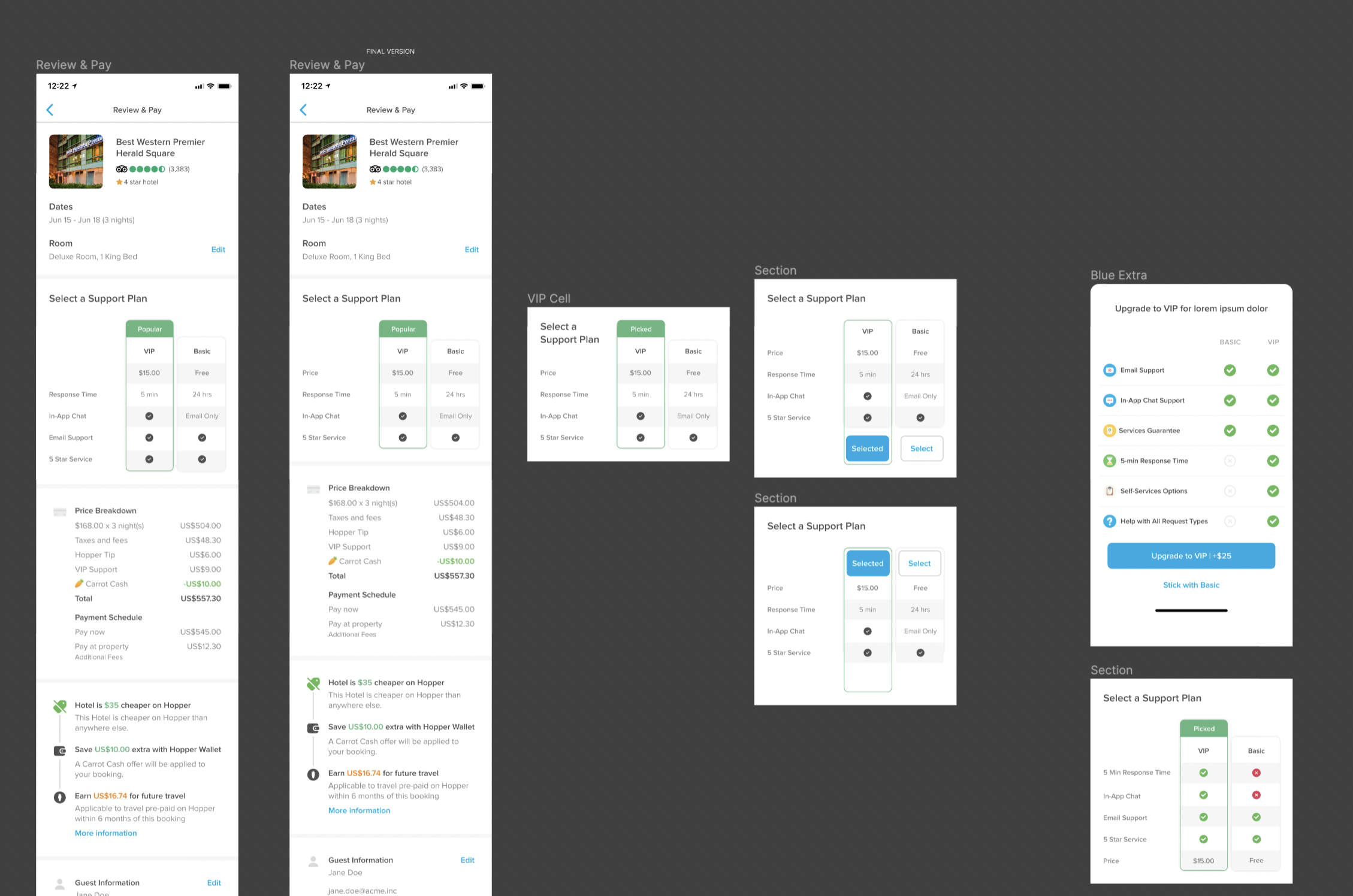
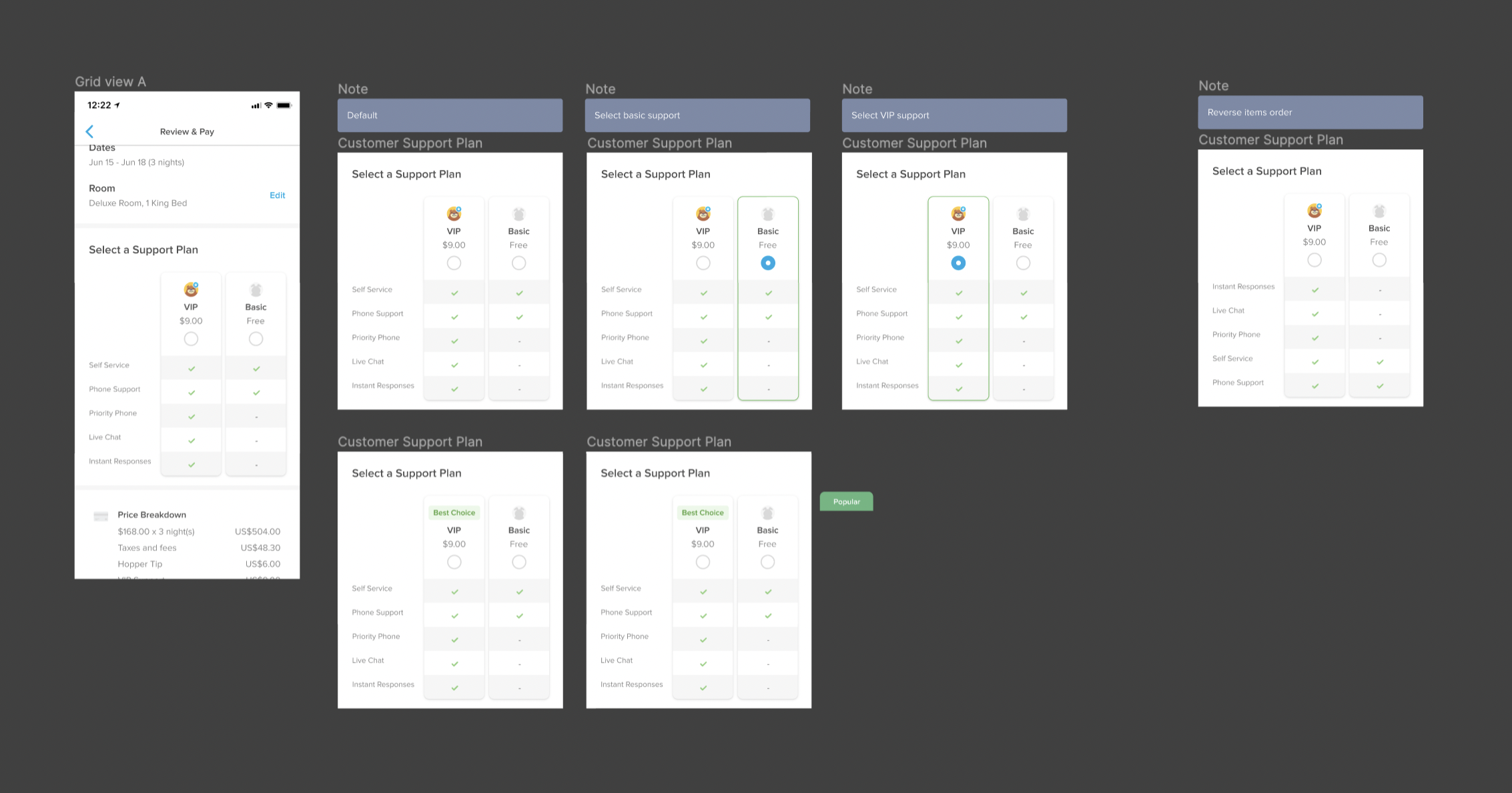
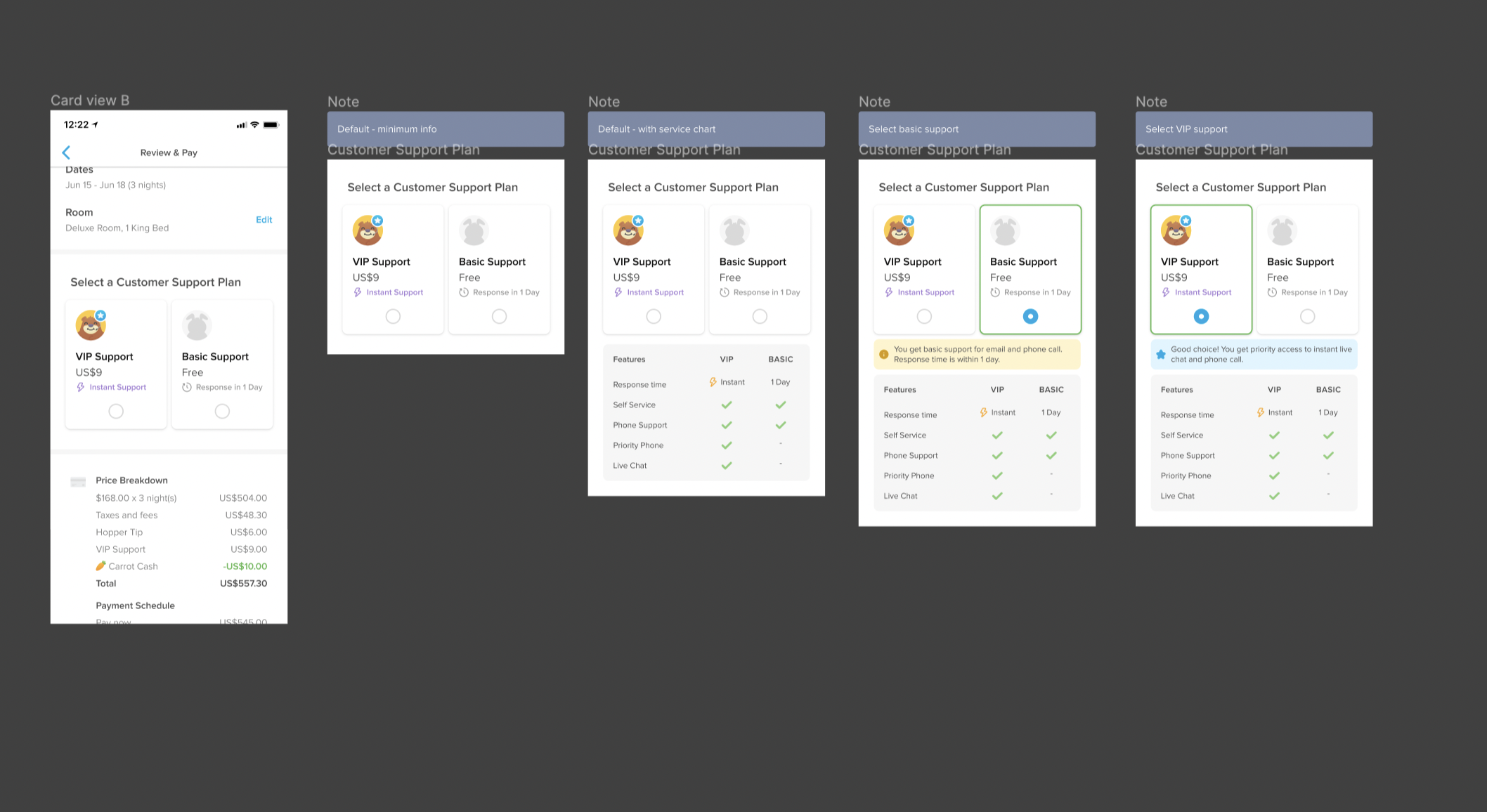
Even though they are big brands to overtake, however, they have identified areas where they could stand out. One of these main areas is making their customer service and integrations with other companies top-notch. Hopper was ready to leverage their expertise in insurance offerings to the next level.
I was approached by Head of Product CX to work with her and her team to quickly create a new stream of stable revenue for the business as a whole.
“Zach was always diligent and effective when creating Figma mockups and prototypes. He did a great job of articulating his rationale and then taking feedback and incorporating it into the design. He often squared off with me and our head of Customer Service and Experience on our work, and was able to navigate those conversations with empathy and understanding.”
- Jim H (Customer Experience Product Manager @ Hopper)
UI Design / iOS native design
Lucky for me, Hopper has a great internal team that has put in a fair share of love and time into their current design system. I was able to jump in and leverage their Design System however, I needed to elevate the design even more while leveraging existing design assets to not overwhelm developers. This lead me to make strides within their UI ecosystem.


UX Design / UX Strategy / Figma Prototypes / Product Design
Hopper prides themselves on being fun which is visible in their UI but I believe also needs to be clearly felt in the experience in their product. Making flows for insurance products and corporate products fun can be a challenge.
Leveraging behavioral design patterns from familiar products as well as design patterns from the existing Hopper product led me to design experiences that both sets of users enjoyed and used.


Typography
Again taking cues from the brand guidelines, I created an extensive set of typography tokens to be used in every product that DriveCentric has and will have. This will allow for easy implementation from dev but also flexibility for designers to use depending on the visual look and feel they wanted to establish.


Base Components
Once the core properties were created I moved on to base components essential to any product such as buttons, tags, chips, inputs and more. Each of these components had their own dedicated page in Figma with:
Component
Various states & sizes
Properties
Anatomy of the component
Examples


Complex Components
After the base components were created, I began to create more complex components that were already being used in DriveCentric's product. This allowed me to slowly evolve the current disjointed design language to a more cohesive and advanced design language.


Results
With now 2 full-time designers on staff who are able to quickly create designs for new features or made adjustments to legacy features, DriveCentric is able to move at an even quicker pace. The dev team is in progress to build out the entire designs system in the dev ecosystem which will result in even quicker roll out of new products and features to continue to have DriveCentric be a leader in the market and beyond.