
Designing a Strategic New Product That Led to Acquisition

Product: Native iOS app & Web App
Company: Monorail
Role: Senior UX & Product Designer
Business Context
Monorail was built to address a growing need for modern, streamlined communication and relationship management within organizations. The market was crowded with legacy tools that were either too complex, too fragmented, or poorly aligned with how teams actually collaborate.
Rather than iterating on an existing product, Monorail was created as a net-new platform designed to simplify workflows and create clarity across communication touchpoints.
This effort was driven by the opportunity to rethink how teams manage and streamline interactions, growing market demand for more intuitive and unified systems, and the need to differentiate in an increasingly competitive landscape. This was not a surface-level design exercise — it required defining how the product should work from first principles.
What Existed Before
Before Monorail, investors seeking a more streamlined, value-driven way to manage their money had to juggle fragmented tools and feature-heavy platforms that created more noise than clarity. Decisions were spread across disconnected systems, making it difficult to see the full picture or act confidently.
There was no cohesive solution that combined simplicity, transparency, and scalability. The opportunity wasn’t just better UI — it was rethinking the product logic so investing felt intuitive, focused, and grounded in real value.

The Strategic Question
The real question wasn’t:“What should the interface look like?”
It was: “How should this product fundamentally work so that teams immediately understand it, adopt it, and rely on it?”
Key constraints included:
Ensuring scalability as adoption increased
Balancing simplicity with powerful workflow capability
Moving quickly enough to support launch and growth
Before
Initial thinking leaned toward feature parity with existing tools in the space. There was pressure to match common industry workflows and conventions.

Reframing the problem
Through mapping user flows and defining system states early, it became clear that replicating legacy patterns would introduce the same friction Monorail was trying to eliminate.
Strategic Direction
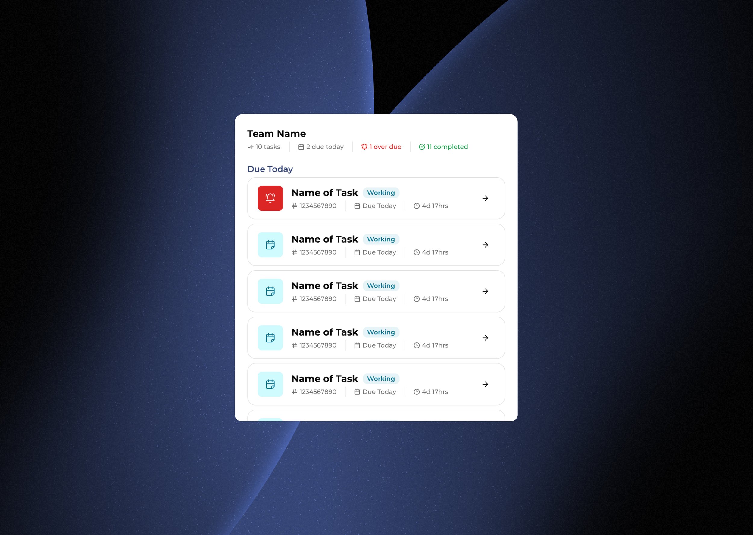
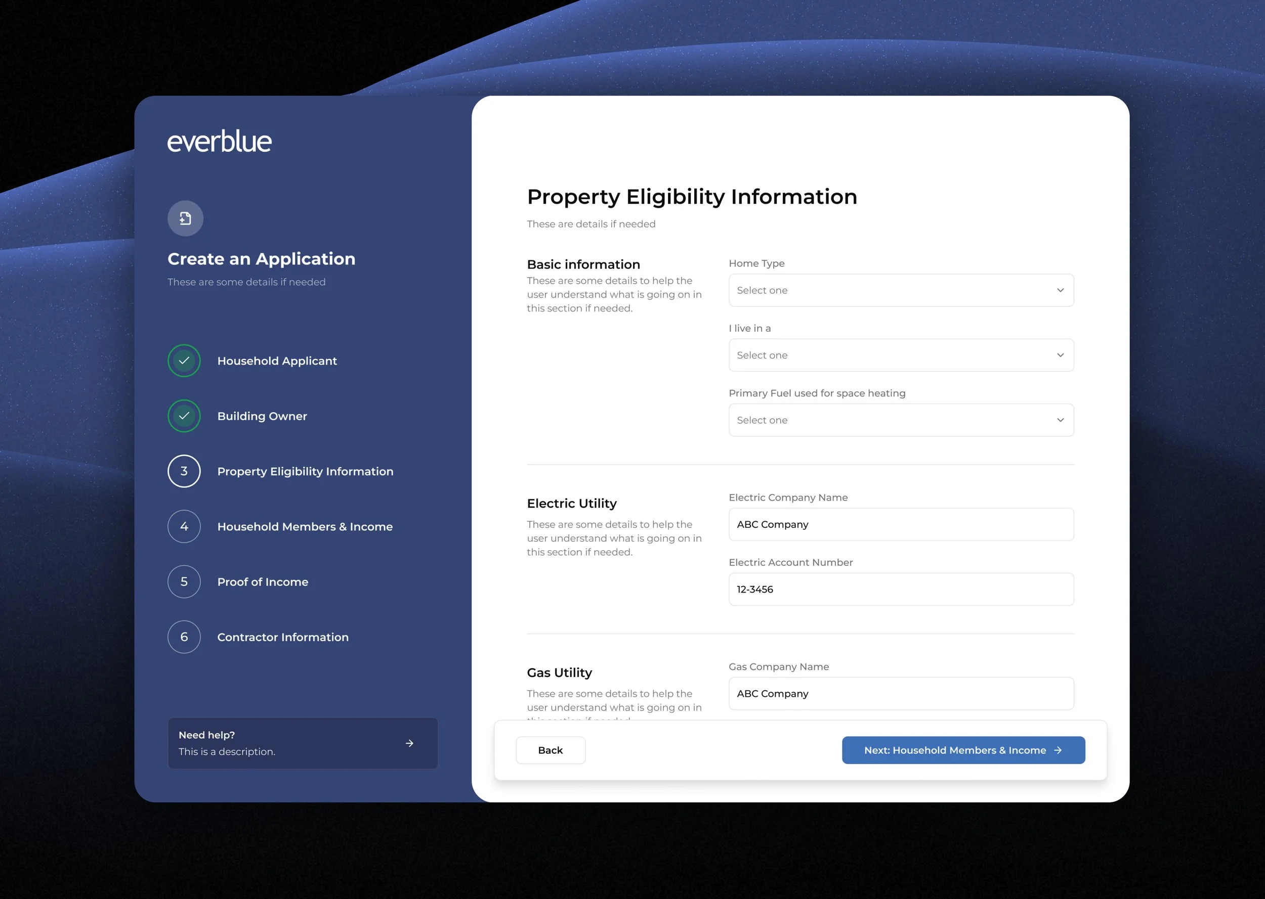
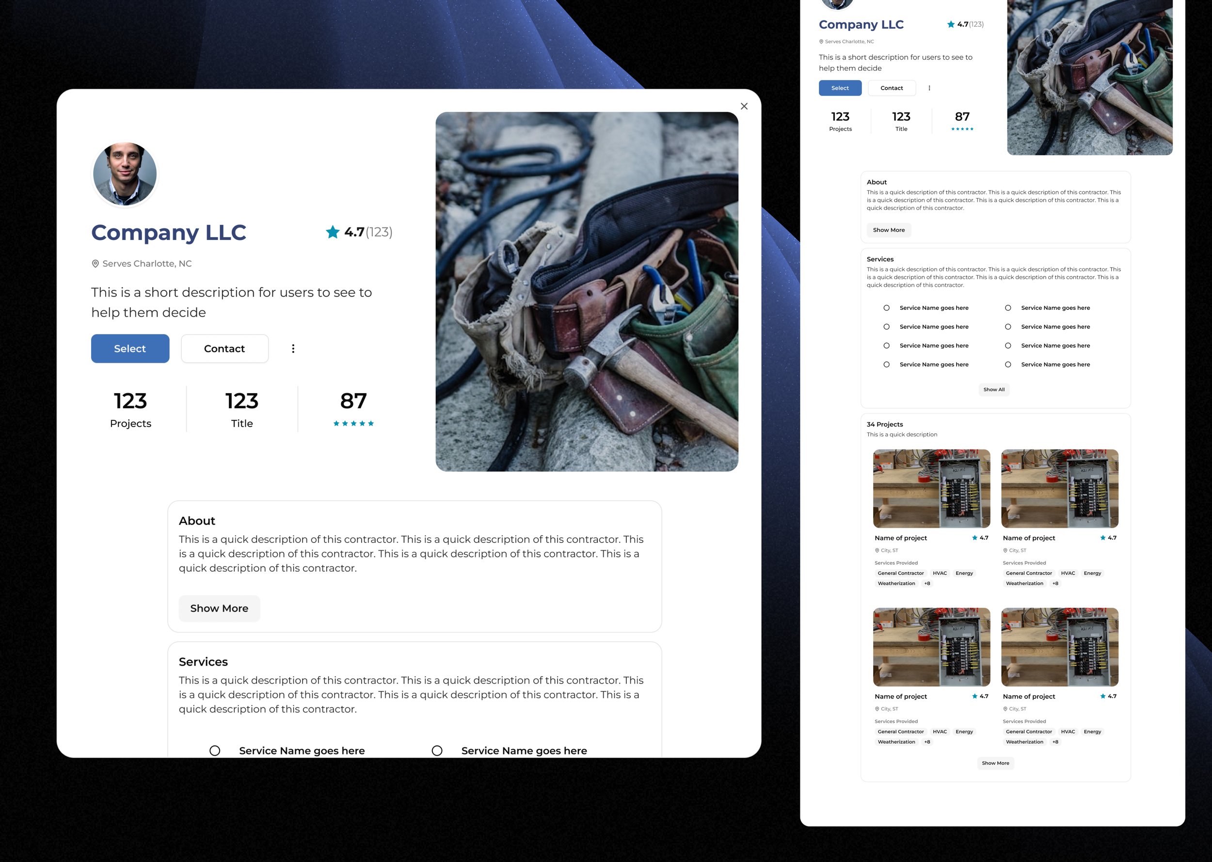
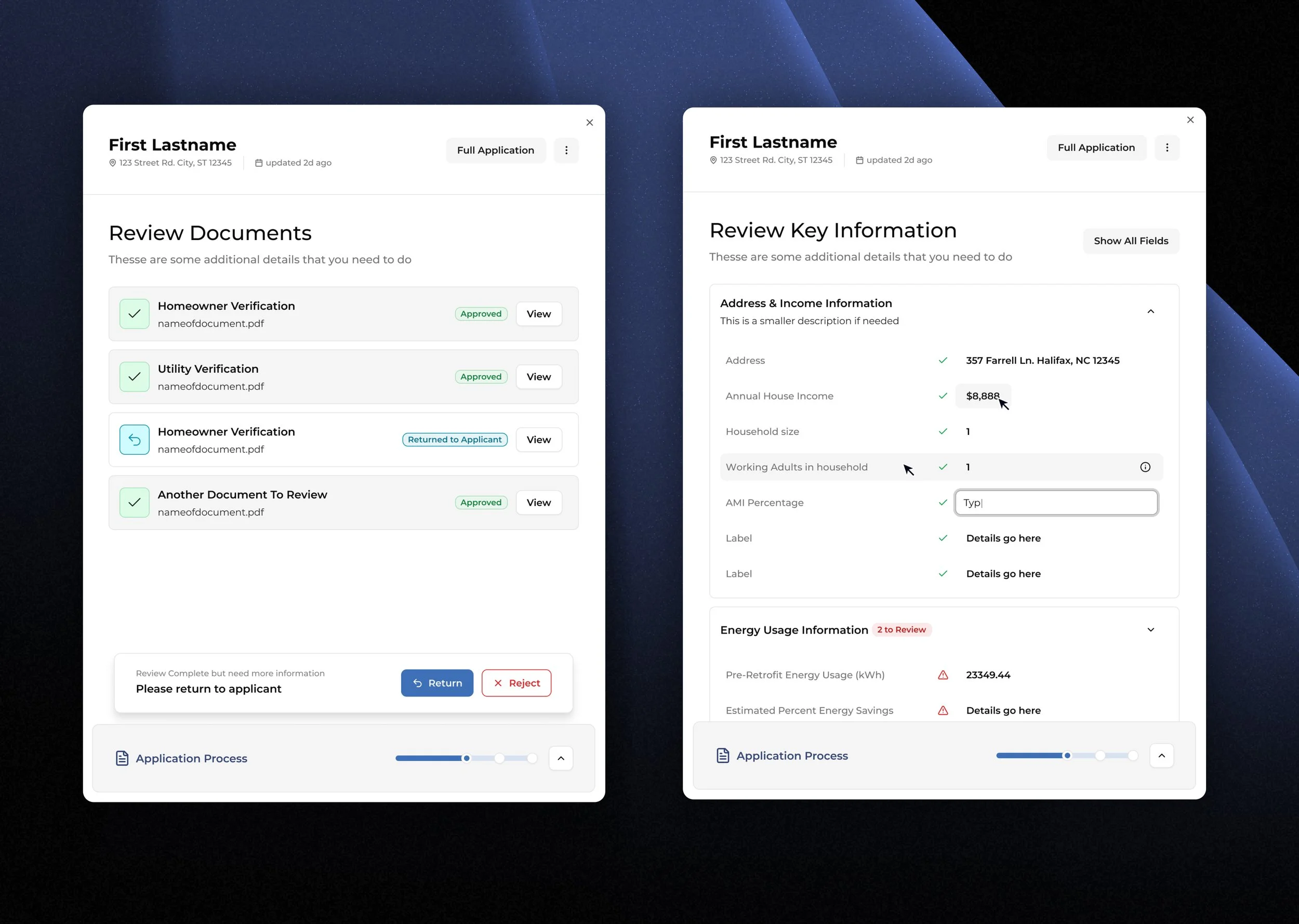
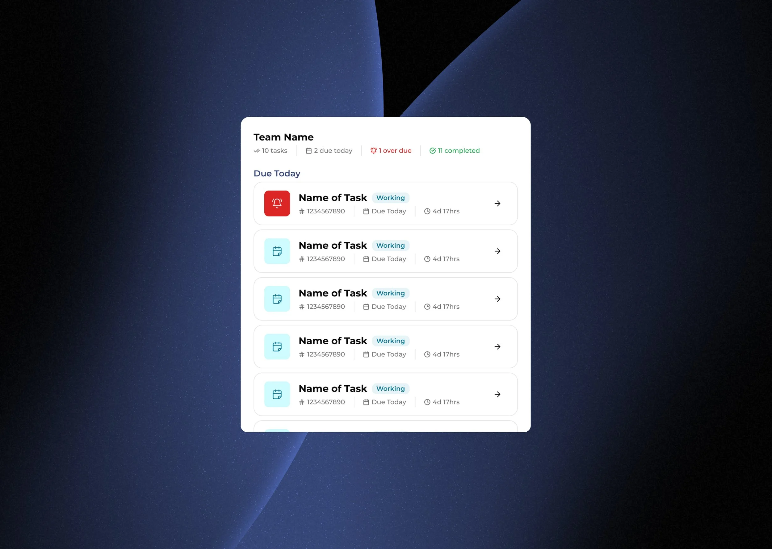
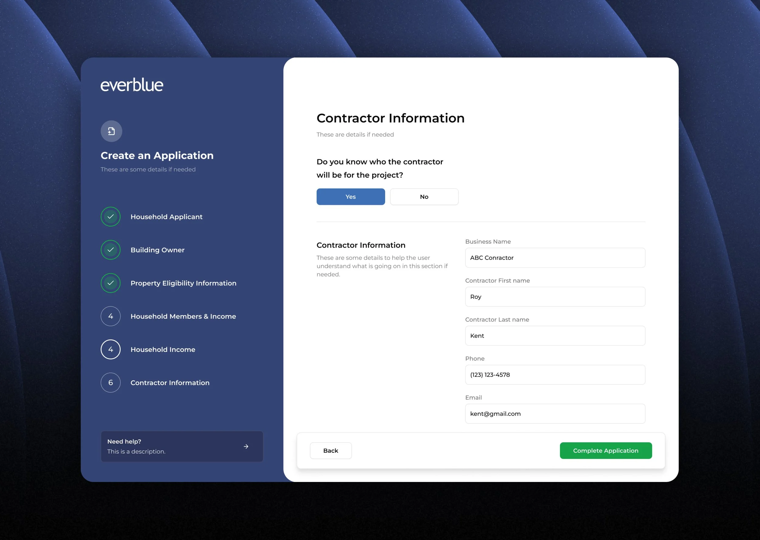
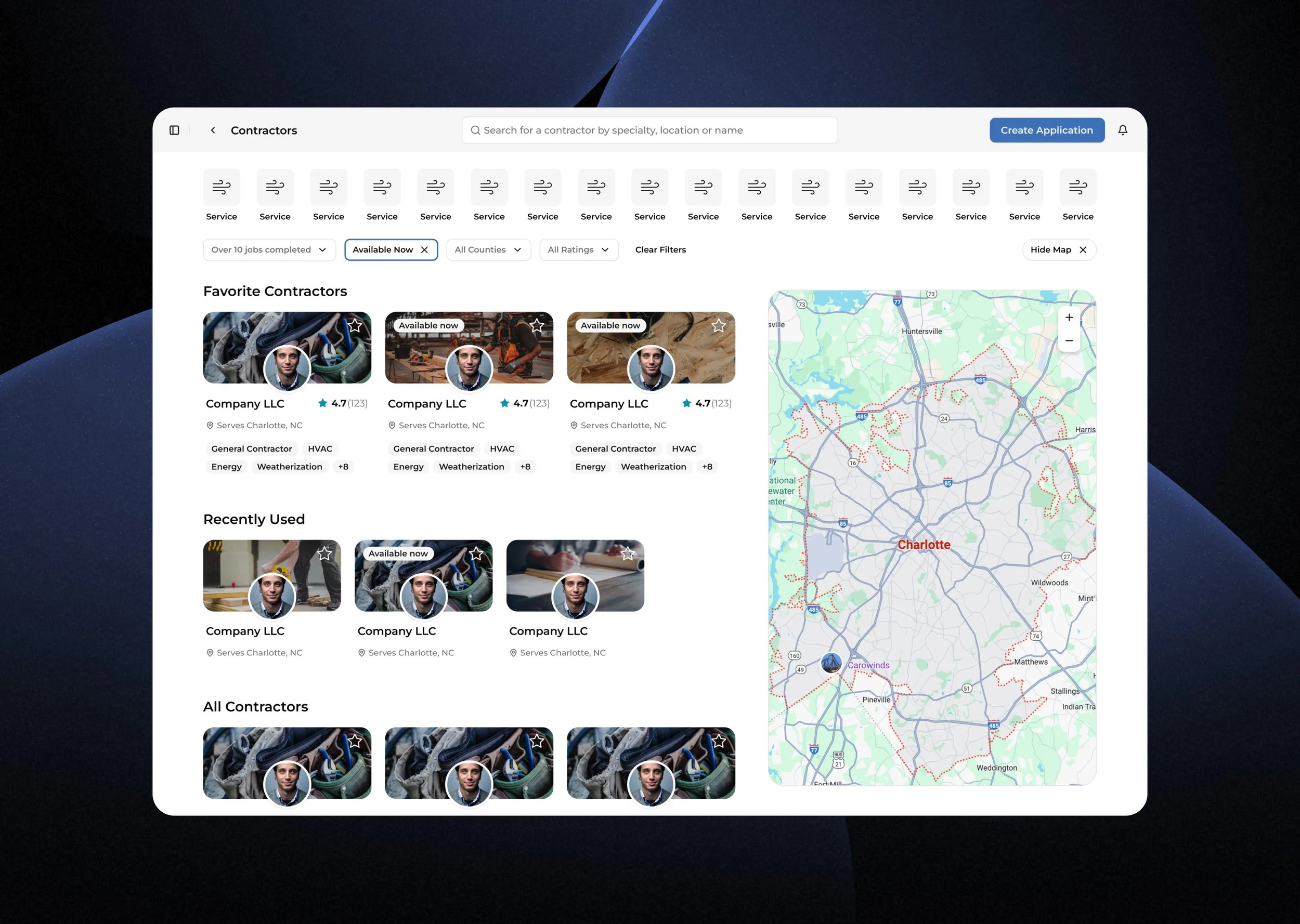
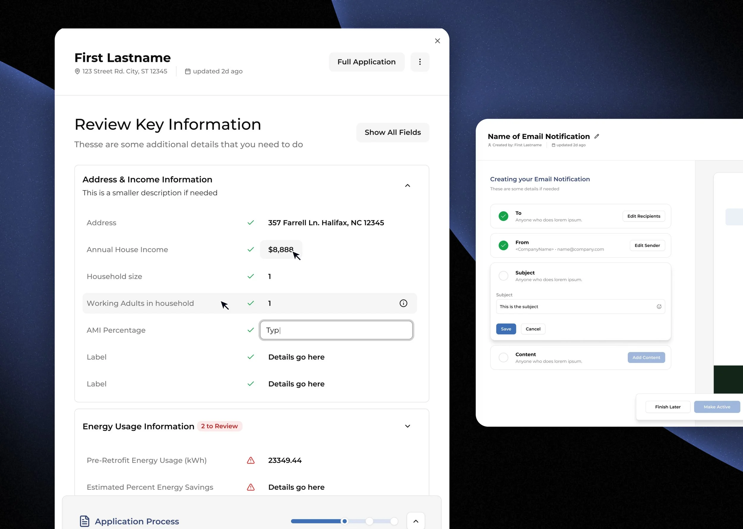
We aligned on a strategy centered on clarity over feature density, intuitive linear flows, reduced cognitive load at every decision point, and scalable patterns from day one. Before any visual polish, I mapped the core UX flows — defining entry points, task paths, decision nodes, and all success, error, and empty states — creating a system that informed engineering architecture as much as interface design.
The Result
The resulting product introduced streamlined, intuitive UX flows designed for immediate comprehension, supported by a cohesive visual system across every screen. It balanced modern UI execution with scalable interaction patterns, creating a consistent experience from onboarding through core workflows and ongoing usage.
What to Explore Next?
•
What to Explore Next? •
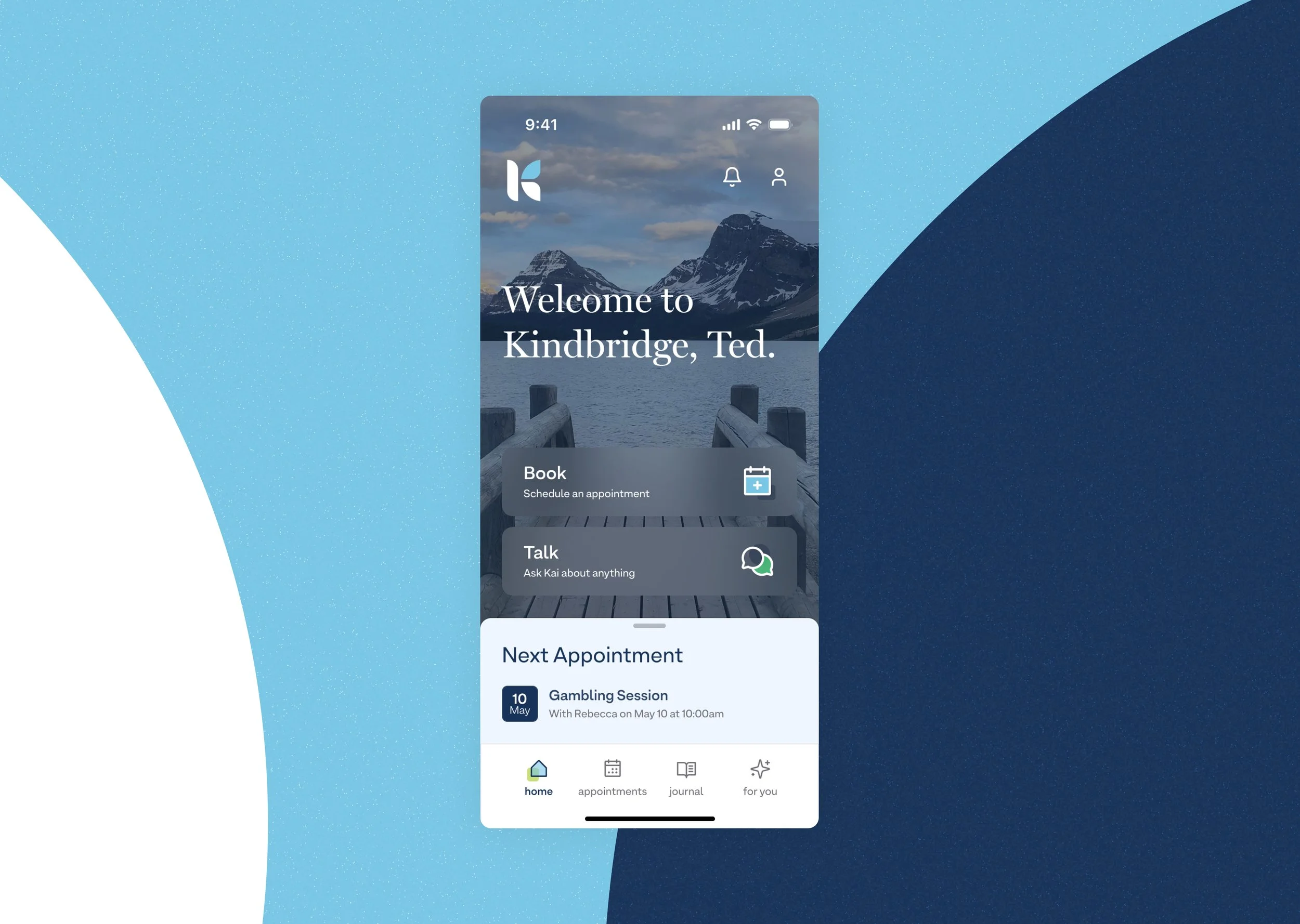
Kindbridge

Ready to make smarter product decisions?
© 2026 ZSmyth LLC
Made in St. Louis MO