
Instantly get more conversions right from your top navigation
Ahhh, yes. The nav bar (navigation bar at the top of your page). The eyebrow of your website.
Ok no one call is that but it is a critical area to focus on for conversions.
When looking at your nav bar your main focus is 2 fold:
- The name of your business
- Directing users/customers to do what you want them to do
That is it.
Everything else is just in support of those 2 objectives.
This would be the wrong way to go about it:
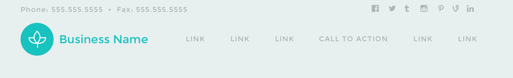
When you first look at this, I'm sure you see the business name first and then for a moment lock up because everything else has the same visual weight.
Though it is clean there is WAY to much going on:
- logo with business name
- social media links
- numerous links to who knows where
- a call to action
- social media links
- phone number
- fax number
7 elements in total may not seem like a big number however that is 7 different elements that a user has to mentally process before moving on or taking an action. The more mental energy your users/customers use the more fatigued they will get which will result in a poor user experience. I'm sure all of these are important to some degree in your business, however you don't need ALL of them in your header to have users convert or take a step towards converting.
Instead of that do this:

Notice the difference.
Distraction free and focused on a goal :)
You know EXACTLY where to go - the CTA
How do you do this...Easy
1 - From your business goals - what is the main action you want a user to do on your site (sign up, buy, register, download, etc)
That is your Call to action for your site
2 - Your navigation should help drive users to that call to action. That could be providing additional features or benefits, pricing, etc. Your navigation should be as minimal as possible to reduce clutter and distractions.
What are some of your hang ups on creating conversion focused navigation on your site?